
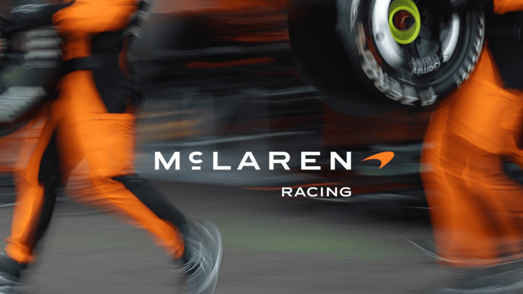
McLaren Reveals New Logo Inspired by Bruce McLaren
McLaren is revisiting its garage-built origins with a new corporate wordmark designed to define the brand’s future production cars, merchandise, and digital presence.
The redesigned identity draws inspiration from the signage of a family-owned service station in Auckland, New Zealand, operated by the parents of founder Bruce McLaren. The garage was where a young Bruce modified a 1929 Austin Seven before driving it to his first motorsport victory at Muriwai Beach.
The new wordmark replaces McLaren’s previous mixed-case badge with an all-uppercase design using a custom typeface called McLaren Sans. A horizontal line beneath the letter C references the original Auckland signage.
McLaren is retaining the Speedmark logo and Speedy Kiwi graphic while introducing a heritage-inspired color palette. It includes Papaya, Ember, Midnight, Black, Anthracite, Colnbrook, and Mist, with every shade drawn from a vintage photograph of Bruce McLaren beside his single-seater race car.
The new identity is intended to create a unified visual language across McLaren Automotive and McLaren Racing. According to the company, the change also supports greater personalization and more immersive community experiences for owners and fans.
The transition is already beginning. The upcoming McLaren W1 is expected to be the final new model produced with the previous mixed-case logo.
Meanwhile, the new design language was previewed during Monterey Car Week through lettering between the taillights of the McL 6GT manual V8 supercar. Following the announcement, its placeholder lettering has been replaced with the complete McLaren wordmark.