
Instagram Retires Its Iconic Cursive Wordmark After a Decade
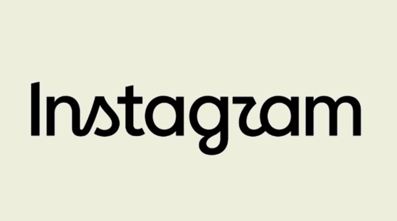
Instagram has redesigned the wordmark that has defined its visual identity for the past decade, replacing its familiar cursive lettering with a hybrid typographic style. The update represents the platform’s first major wordmark change since 2016 and forms part of a broader redesign of Instagram’s visual identity.
The change does not replace Instagram’s instantly recognisable camera icon. Instead, the company has retained its multicoloured gradient symbol while introducing new typography with heavier strokes, sharper forms, and selectively exaggerated curves.
Instagram Introduces a New Typographic Identity
The redesigned wordmark combines elements of cursive lettering with more structured print typography. Several characters feature distinctive new shapes, particularly the letters “s,” “r” and “g,” giving the logo a more contemporary appearance while retaining some of the flowing character associated with the previous design.
The change follows an extensive exploration process by Instagram’s design team. Designers reportedly considered hundreds of directions, ranging from highly structured all-caps treatments to handwriting-inspired concepts, before settling on the current hybrid approach.
Jasmine Probst, Instagram’s director of product design, said the chosen direction was intended to preserve a sense of individuality while introducing bolder and simpler elements. The result forms part of a wider effort to create a more cohesive visual system across Instagram’s products and user experiences.
Alongside the wordmark, Instagram is introducing three custom typeface families: Instagram Sans, Instagram Pen and Instagram Mono. These fonts will give the platform greater control over how its identity appears across different interfaces and creative formats.
The company’s familiar gradient will also receive a more restrained treatment throughout the interface. Instagram plans to introduce the broader design system globally in 2026.
A Major Brand Shift for Instagram and Meta
The redesign extends beyond a new logo. Instead, it represents another stage in Instagram’s effort to develop a visual language that works across its increasingly broad ecosystem of video, messaging, creator tools and social features.
Instagram remains closely connected to Meta’s wider family of platforms, including Facebook and Threads. Consequently, changes to its typography and interface design also contribute to a broader evolution of the visual relationship between Meta’s consumer products.
The decision to retain the camera icon is particularly significant because the symbol has become one of the most recognisable elements of Instagram’s identity. By preserving it while changing the accompanying typography, the company can introduce a substantial visual update without abandoning its most established brand asset.
The redesign also reflects how social platforms increasingly treat typography as part of the product experience rather than simply as corporate branding. Custom typefaces can appear across interfaces, creator tools, campaigns, and editorial content, allowing Instagram to create a more consistent visual identity across its ecosystem.
Instagram’s New Logo Sparks Mixed Reactions
The redesign has already generated divided reactions among users and design observers. While some have welcomed the more contemporary direction, others have criticised the unusual letterforms, with some viewers arguing that the stylised lettering makes the name difficult to read.
That response highlights the challenge of changing a visual identity that users have encountered daily for years. The previous cursive wordmark had become closely associated with Instagram’s identity since its 2016 redesign, making even relatively subtle changes immediately noticeable.
Instagram head Adam Mosseri has also embraced the discussion, sharing the redesign through his personal social channels and inviting reactions from the community. The approach places the redesign directly within the same social environment that the new identity is intended to represent.
Ultimately, Instagram’s latest visual update is less about abandoning its established identity than changing how that identity functions across a modern social platform. The retained camera icon preserves continuity, while the new typography, custom fonts and revised gradient treatment give Instagram greater flexibility as its products and creative formats continue to evolve.